

 Mosher and His Place In Printing History
When Mosher published his first book in 1891, thereby founding the first significant private press1 in America, the printing arts on this continent as well as in England were in ferment. The craft of printing carefully designed books had atrophied in the wake of the industrial revolution. Demand for cheap reading material by an expanding literate public was met by the mass production of books with little or no attention to design and aesthetics. A few printers maintained the tradition of Aldus, Baskerville, and Janson-most noticeably Charles Whittingham at the Chiswick Press in England and Theodore DeVinne in America. One can find beautiful examples of the printer’s art from this period, but they were the exception rather than the rule. As Ruskin so eloquently complained, the age of the machine had debased the worker and his products.
With the birth of the Arts and Crafts movement in the early 1880’s, a new respect for handicrafts was also born. They were hailed as equals to the traditional fine arts. The reform slowly spread to the printing craft. James Abbot McNeil Whistler, distressed by the general quality of books printed, had taken to designing his own books. Arthur H. Mackmurdo’s title page for Wren’s City Churches showed that a thoughtfully designed title page could express the soul of a book. The Hobby Horse, the movement’s herald, started in 1884 by the Century Guild, was well-designed and printed.2 William Morris, the movement’s charismatic leader, worked with Charles Jacobi at the Chiswick Press on the design of his own books. Jacobi and Morris were operating within the confines of a commercial environment and the results did not come up to Morris’s expectations, which were shaped by his loving study of medieval manuscripts and incunabula (books printed before 1500). In 1890 this disappointment led Morris to found his own Kelmscott Press, where he could control all elements of bookmaking: typeface, design, choice of ink and paper, as well as the actual printing of the book on a hand press. The Kelmscott Press books reflect the influence that early printed books had on Morris. The margins increase in size from gutter to top to fore and to tail; the small, densely black type is set with no leading; woodcut ornaments and decorations, in harmony with type and text, reinforce the solid black appearance of the page.
Although Morris inspired the efflorescence of private presses that sprung into eager life between 1891 and 1910, his philosophy of design and typography was more influential than his Kelmscott books, which have been criticized for being made to be looked at rather than read.3 Yet these books were shining proof that books could unite the hand and soul of the bookmaker and give a beautiful body to the writer’s creation-proof also that readers did not have to settle for shoddiness.
As Susan O. Thompson points out, not all designers and printers shared Morris’s medieval interests, and many sought their inspiration in the books of Aldus and the French Renaissance: smaller in format, with wider margins, small, old-style faces, and few but well-chosen decoration.4 Thompson calls the style Aesthetic because it was associated with the writers belonging to the literary movement of that name and their literary publishers (Elkins Mathews and John Lane’s the Bodley Head in England, Copeland and Day in America among them.)
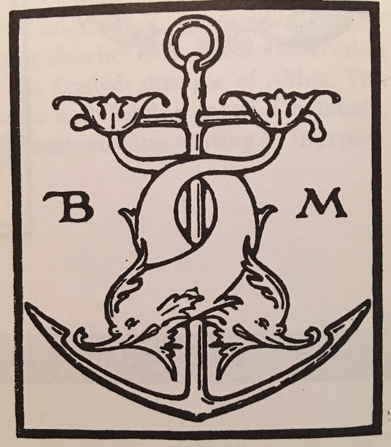
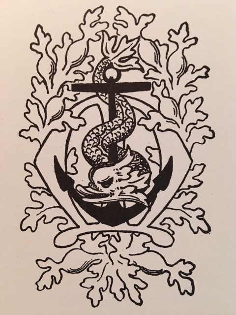
Mosher was aware of the reform of printing brought about by the Arts and Crafts movement, probably through the Hobby Horse, of which he owned a complete set [now at Dartmouth College and in the Bishop Collection], and the Inland Printer; he was aware as well of Morris (he owned seven Kelmscott books and published nineteen titles by Morris) and his conception of what a book should be. With Morris, Mosher shared a concern for the beauty and design of the page, an attention to details, and the idea of a book as a unit rather than a series of pages.5 But, unlike Morris, he aimed at simplicity and quiet elegance, taking as his models the unassuming books printed in Oxford between 1845 and 1906 by the Reverend Daniel; the books printed, for William Pickering, by the Chiswick Press (to which he admitted his debt); those of the Bodley Head;6 and those of Aldus. Mosher’s choice of a dolphin as an element of his logo is an homage both to Aldus and to Pickering. Mosher became the foremost proponent of the Aesthetic style in America.
Mosher, a passionate lover of literature, believed that “nothing is worth printing that is not worth printing well, accurately, beautifully; yet with simplicity and at moderate cost, so as to be within the reach of everyone.”7 It is his concern with cost that distinguishes him from the other private-press owners, whose books were often beyond the reach of any but the well-to-do. Along with another “outsider” of the private press movement, Elbert Hubbard of the Roycroft Press, Mosher was responsible for bringing to the general public an awareness of the importance and value of a book well made. Joseph Blumenthal acknowledged the impact of the Mosher books on the reading public:
[S]mall, modest and inexpensive, they were bought by thousands of literate men and women whose pleasure in reading was enhanced by fine paper, good workmanship, and an unassuming and quiet typographic elegance.8
Most of the presses that flourished at the turn of the century were the product of youthful enthusiasm. Their founders were longer on idealism than business experience, and consequently the majority lasted but a few years. Mosher sustained his “program of splendid literary output”9 until his death in 1923, and was succeeded by his long-time, able secretary, Flora Lamb.
Although, to provide a welcome income, he published such standard chestnuts of the period as the Rubáiyát and Elizabeth Barrett Browning’s Sonnets from the Portuguese (over 15,000 copies of the Sonnets were printed in ten different editions), his lasting contribution is his resurrection of little-known works that were out of print or that had been issued in such limited English editions that the American public never had a chance to discover them. His interests ranged widely-from Michelangelo’s Sonnets to Ruskin’s Sesame and Lilies to Yeats’ The Land of Heart’s Desire, from Oscar Wilde’s The Happy Prince to Whitman’s Memories of President Lincoln.
This eclecticism sometimes led him to ignore the right of prior publication, although he paid modest “royalties” to the authors whose works he published without permission. It was such insouciance that earned him the well-deserved sobriquet of “pirate.”10 Mosher delighted in controversy. (There is no such thing as bad publicity!) When threatened by Hilaire Belloc with legal action should he publish another unauthorized version of Belloc’s work, Mosher went ahead anyway, and there the matter rested. Much has been made, at that time and since, of Mosher’s piracy, but the fact remains that were it not for Mosher these works would not have been available to the public.

Because he was not a designer, Mosher adapted many graphic elements from books that he admired, modifying them until they met his exacting standards. If the label “pirate” has to be attached to his name, it should be because he rarely acknowledged the British artists Laurence Housman, Herbert Home, Lucien Pissarro, and Charles Ricketts among them) whose decorations and floriated initials he appropriated. American graphic artists, however, fared better with Mosher, since he paid them for their work: the young Bruce Rogers, who later called Mosher the “Aldus of the XIX Century,” received two of his earliest commissions from Mosher, as did Frederic Goudy, who designed covers for the Vest Pocket Series and for the Old World Series,11 along with Thomas Maitland Cleland and Earl Stetson Crawford.
Mosher’s influence on the art of the book was greater on contemporary commercial publishers than on the private presses of the day. The success of his books proved that a book could be beautifully designed yet inexpensive and that there was an avid public for these books. Literary publishers such as Copeland and Day and Stone and Kimball, as well as commercial publishers like Houghton, Mifflin and Company, issued carefully designed books that united typography, page make-up, and the spare use of decoration in an elegant whole; their debt to Mosher is indisputable.
As A. E. Newton remarked, “Our printers owe as much to Mosher as to Morris.”12 This debt is evident in the work of later presses, such as Hal and Violet Trovillion’s Trovillion Private Press (1908-1958)13, Peter Beilenson’s Peter Pauper Press14, and E. B. Thompson’s Hawthorn Press. Today, the style of most private presses owes more to Mosher’s restrained elegance than to Morris’s “pocket cathedrals.”
The above is Chapter 2 from Vilain & Bishop’s Thomas Bird Mosher and the Art of the Book (Philadelphia: F. A. Davis, 1992, pp. 5-7), and is here reprinted with permission from the publisher.
- Definitions of what is a private press abound, and there is disagreement about whether Mosher belongs to that group, but surely Will Ransom’s statement applies here: “A private press may be defined as the typographic expression of an ideal, conceived in freedom and maintained in independence” (Will Ransom, Private Presses and Their Books. NY: R. R. Bowker, 1929, p. 22). The fact that Mosher used commercially available fonts and entrusted the printing of his books (under his supervision) to commercial printers disqualifies him, in the eye of some critics, from the group of private press owners. But Morris employed pressmen, Ricketts’ Vale Press books were printed by Ballantyne, and many private presses (among them Vincent and Caradoc in England, Blue Sky and Cranbrook in the United States) used commercial fonts.
- James G. Nelson. The Early Nineties: A View from The Bodley Head. Cambridge: Harvard University Press, 1971, p. 65. See also William S. Peterson. The Kelmscott Press: A History of William Morris’s Typographical Adventure. Berkeley: The University of California Press, 1991, p. 38.
- Roderick Cave. The Private Presses. NY: R. R. Bowker, 1983, p. 111, quoting Holbrook Jackson’s 1938 address to the Double Crown Club.
- Susan Otis Thompson. American Book Design and William Morris. NY: R. R. Bowker, 1977, pp. 10-11.
- Keith G. Huntress. “Thomas Bird Mosher: A Bibliographical and Literary Study” (unpublished dissertation), Urbana: University of Illinois, 1942, p. 137.
- Richard Le Gallienne, a friend and author of Mosher’s, began his career as a reader for the Bodley Head.
- Annie H. Matthews. Thomas Bird Mosher of Portland, Maine. Portland: The Southworth-Anthoensen Press, 1942, p. 1.
- Joseph Blumenthal. The Printed Book in America. Boston: David R. Godine, 1977, p. 41.
- Blumenthal, ibid.
- A sobriquet that he would have amply earned solely for his appropriation of successful designs, as in the case of the Garland of Rachel (originally published by the Daniel Press) or in the case of his facsimile of the Kelmscott Hand and Soul, which he thought superior to Morris’s (Strouse, op. cit., 1962, p. 65).
- For the Old World Series, Mosher had asked Goudy to match the lettering designed by Rogers for the title page: D. J. R. Bruckner. Frederic Goudy. NY: Harry N. Abrams, Inc., 1990, p. 48.
- A. E. Newton. The Book-Collecting Game. Boston: Little, Brown, 1928, quoted in the foreword to the 1929 Mosher catalogue.
- Alan M. Cohn, the compiler of a checklist to a 1959 exhibition at the Southern Illinois University Library in honor of the fiftieth anniversary of The Trovillion Private Press, mentions that ” ‘Dear Old Tom’ as Trovillion called him … was an early influence on the Trovillions.”
- “Mosher’s work was well-known and loved by me when I started… Mosher, Rogers et al, were looking backward at earlier periods of printing (as did architects and other designers in the early 1900s) and I-with reservations-looked back at the lookers.” Peter Beilenson, quoted by Franklin P. Lincoln in the Dec. 6, 1962 Press Herald (Portland).