America’s Thomas Bird Mosher Phenomena
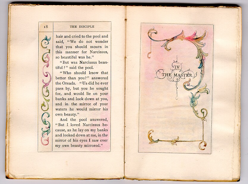
As stated in the proposal: the 1998 bibliography on books published by Thomas Bird Mosher (TBM) was the first serious attempt to comprehensively show the multi-faceted relationships between what was taking place between late-Victorian British publishing and this unique American publisher as conduit for “England’s National Literature & Design.” In 1999 the Grolier Club exhibition “A Century for the Century” included Mosher’s Ten Spiritual Designs as one of the hundred finest designed books of the 20th Century—a book heavily embellished with Eragny Press designs. Further elaboration along this line took place when the Grolier Club hosted its 2007 Eragny Press exhibition which demonstrated that”…it was the ‘Pirate Prince of Publishers,’ Thomas Bird Mosher of Portland, Maine, who gave Lucien Pissarro’s designs their widest circulation in this country.” More recently Adela Pinch’s article on “Transatlantic Modern Love” focused on TBM as “…an odd bird whose printing of Modern Love in 1891 inaugurated a strange and fascinating career as a publisher [who] amazed Americans with the elegance of his edition of Modern Love and of the other increasingly elaborate, art nouveauish literary volumes that quickly started pouring forth from Portland, Maine.” TBM not only became one of America’s chief exponents of Pre-Raphaelite poetry and literature, publishing texts by Morris, Swinburne, Pater, Rossetti, Wilde, et.al., but did so by molding his own publications in a style and format expressive of what Pre-Raphaelite and fin de siècle authors and publishers were seeing produced in England—thereby creating his own set of “Blue China” for collection by his reader public. TBM himself was doubly reflective in that he not only wanted to pave the way for ordinary Americans to witness first-hand what Pre-Raphaelite literature as an aesthetic object was like, but also sought to impress his British counterparts by showing what a small American press could produce along similar aesthetic lines. He did so to their consternation.
The purpose of this presentation was to illustrate TBM’s play off of British publications. Key books from the press were selected to show their roots in British texts and design. For example, comparisons were shown using The Blessed Damozel (Vale vs. Mosher); Mosher’s use of the quintessential fin de siècle publication Silverpoints; the indebtedness of Mosher’s earliest book design to Frank Murry’s publications from Derby; and the redesigned Rossetti’s Hand and Soul as a case-in-point for how TBM sourced some of his texts and designs. Also briefly discussed was Mosher’s edition of The Germ with its Ricketts cover design, and the design origins of a few other Mosher publications. A display case of other examples accompanied the presentation.

